top of page
Logo Design
Brief: To select a business in Leeds which would benefit from an improved logo design. Once selected a new and improved logo should be created as well as an accompanying style guide. This project was completed at university in year 1.
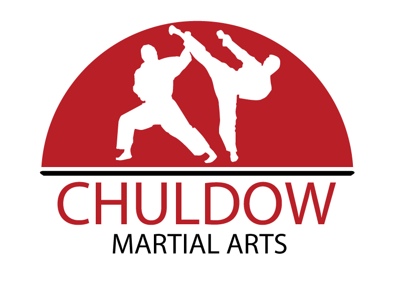
The main aim of this logo was to ensure that it clearly represented itself as a Martial Arts company, whilst remaining unique. One of the main features of the logo, the semi-circle which encases the two karate figures was based off of the Japanese flag. I chose to incorporate this within the logo design due to Karate's origins within the country. This therefore also adds to the logos immediate identification as a karate logo.
bottom of page
